👉 Note: Shrimp Welfare Project has moved website builders, changing their design to fit the new editor. The changes in this project are no longer live.
Project vision
Shrimp Welfare Project is an organization that aims to improve the lives of farmed shrimps globally by working directly with farmers and policy makers. As an advocate for animal welfare, I was brought on as a volunteer to help boost their website and create graphics for social media engagement. In order to drive more traffic to their site (and therefore allow them to do more good), I offered to do some redesigning - while keeping true to their current feel, branding and look.
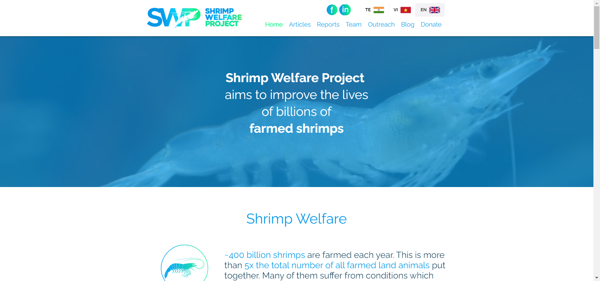
I began by reviewing their current site and seeing where it could be improved upon.
Challenges
Sometimes, starting from scratch is easier. This time, I'll be working with an already made product, and trying to make it more effective in it's purpose and look.
Some of the challenges I anticipate will be creating a product that pleases both the organization and provides function to the user - not just the former or just the latter.
Kickoff
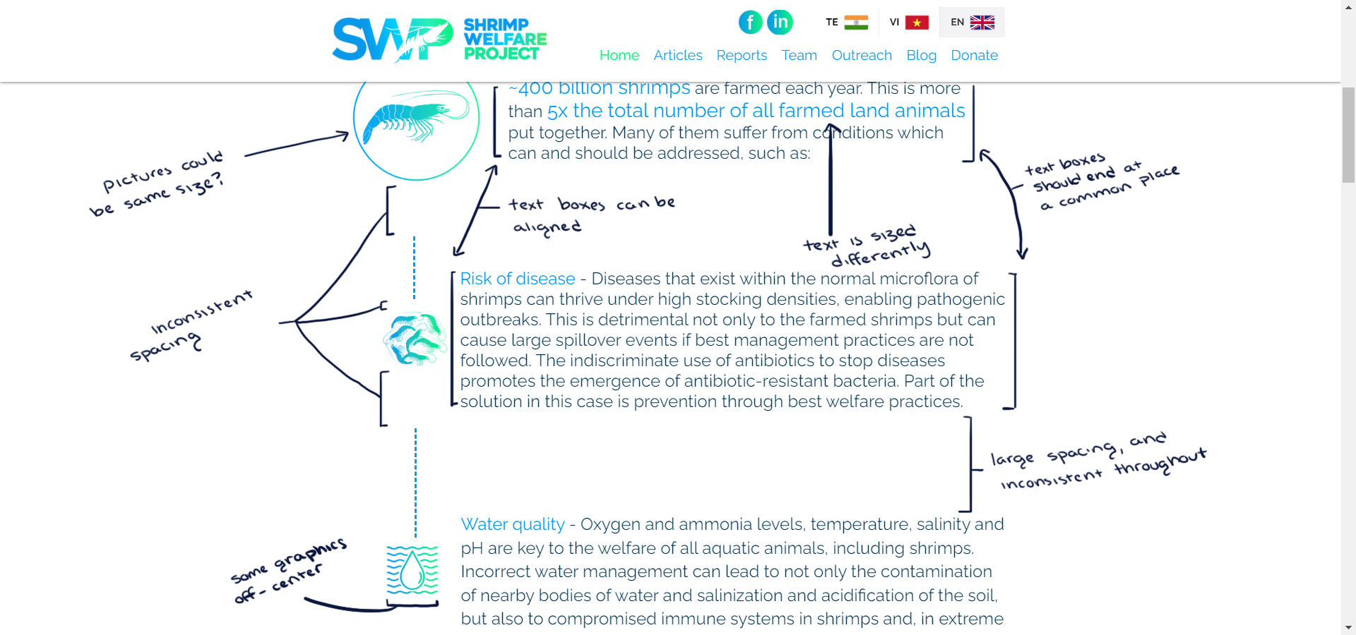
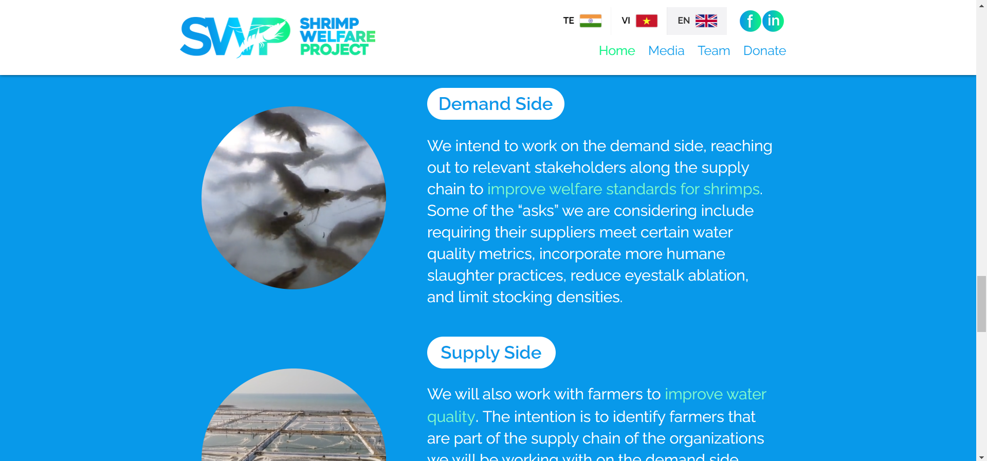
I began to survey the website myself first, to see what design elements could be improved from a designer's perspective.
After exploring the home page, navigation and information presented, I saw room for improvement and set out to do so.
Initial user research
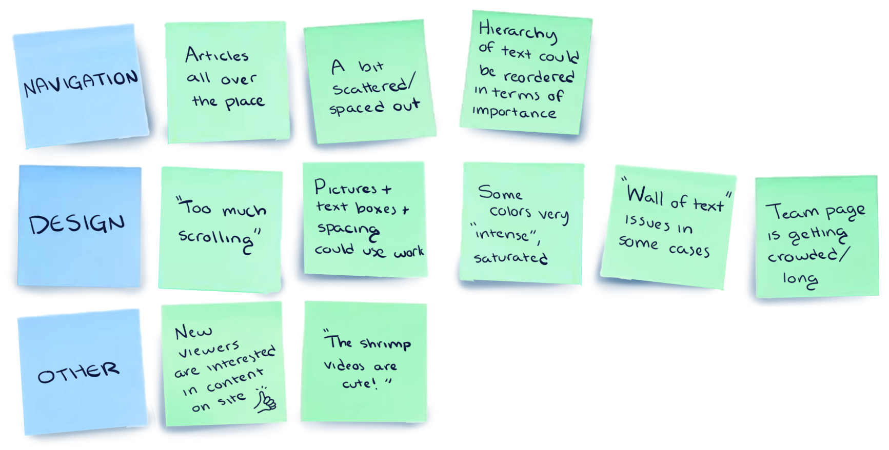
I woked closely with the co-founders and employees of Shrimp Welfare Project and initially asked their concerns and wishes regarding the website. I also gathered a handful of volunteers to explore the website as-is and give feedback on it. Volunteers were aged from 18-62 and had never before heard of Shrimp Welfare Project.
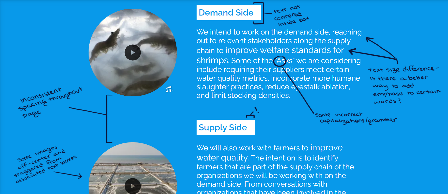
There were some areas of the site that generated confusion, or had some inconsistencies in design. I gathered the feedback and organized it so that I had a list of tasks to start working on.
Meet the users
Competitive analysis
There is no shortage of animal rights webpages, non profits, organizations and people. I chose a broad scope of websites that had similar goals to Shrimp Welfare Project, and aimed to see what I could learn from them.
After viewing what other non profits were doing, I saw that improvements in navigation, image use and other features could be improved upon. Much of this was already mentioned by the initial volunteer interviews.
Adaptation of design proceses
Because I was iterating on a website already built, the usual next steps of UX Design from this point on get a bit mixed up. Some steps were eliminated completely, and in some cases, new steps were added.
I began to focus on individual pages of the site, addressing their issues and then repeating that for each page that needed attention.
Changes to the Home page
This was a relativley quick set of fixes, that didn't need wireframes or much testing - some inconsistencies in spacing, size, grammar, and other small details were spot-corrected to address the problems.
After moving some things around, resizing and realigning, things looked much more uniform.
Complete redesign of the Team page & footer
The Team page of the website was in dire need of redesign. In the early days of Shrimp Welfare Project, there was only a few faces and bios to show - but as the organization grew, this page became longer and longer, and also showed some layout issues, as well as problems with it's responsiveness when switching to mobile.
My goal here was to consolidate the design, make the layout consistent, give it an updated, more refined appearance.
Bio layout exploration:
Before the changes:
After the changes:
Some noteable, major changes that were made included the condensing, resizing and reformatting of the "Partners" and "Supported by" subsections, changing the footer on all pages, realigning and redesigning each person's photo, adding a hover-to-view bio feature for each individual, and eliminating unneccesary white space on the page, which minimized the overall length of the page. Due to the nature of the WYSIWYG website editor I was constrained to working with, some swaths of large white space were unavoidable without code injection - but all in all, page lengths were reduced and objects were revised and made more uniform.
I also ensured that the designs translated well over to the mobile version of the site, redesigning for mobile when neccesary but otherwise creating responsive features that adapted well to different screen sizes.
Reshuffling of the navigation
I felt the navigation could use a bit of condensing. There's a lot of media and reading material available on the site, but there are multiple links in the main menu for it, in addition to articles and other things scattered about the site. Some of the feedback I received in the first round of user interviews was to make this easier to navigate.
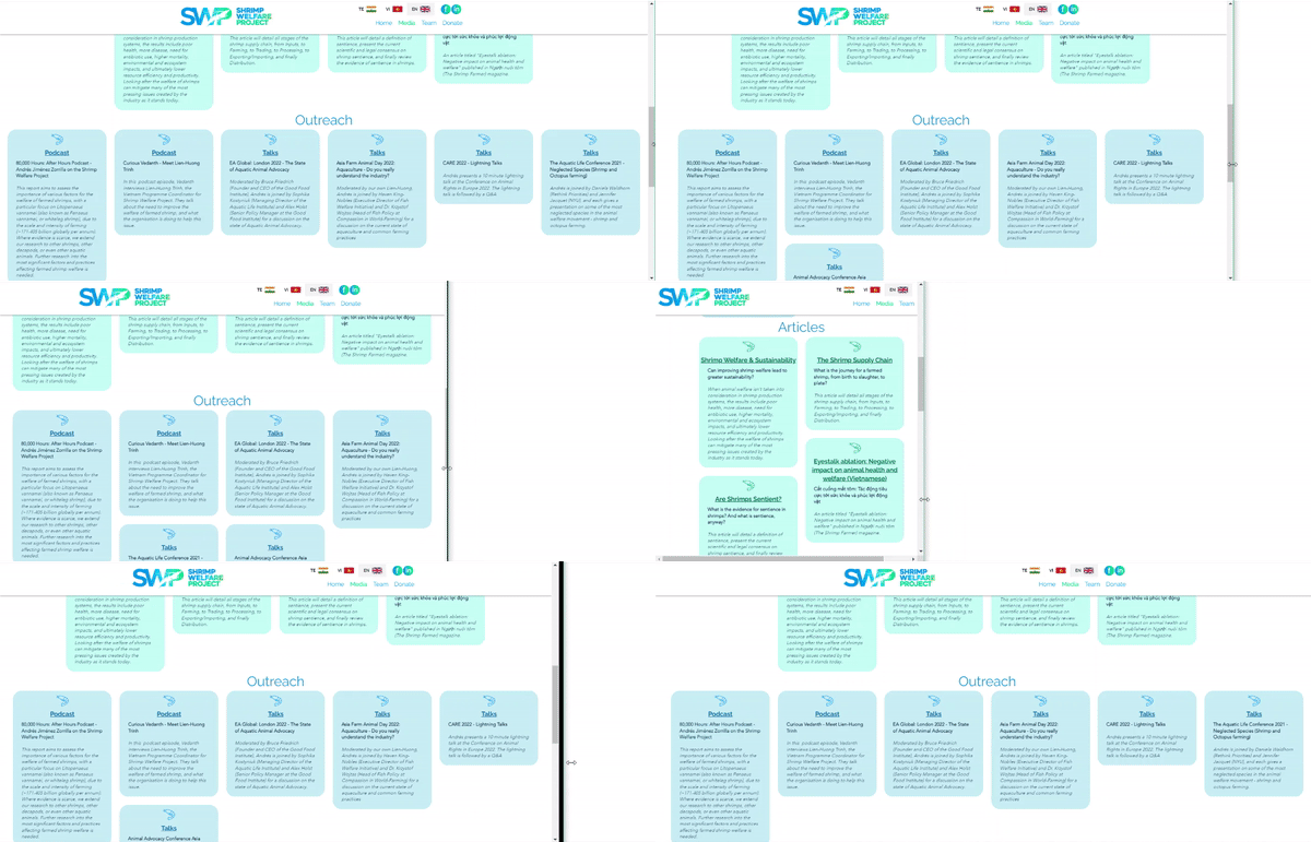
This was pretty straightforward - I simply moved some pages around, reduced the number of clickable links and the need to backtrack, and renamed a single menu tab to "Media". I redesigned the look of the Outreach, Articles and Reports pages, condensing them into a single page, and gave it a visual makeover.
Finally, I added a drop-down feature to the main menu, so that a sub-menu would allow clickable areas in the Media page to be accessed easily.
Main menu before the changes:
Condensed menu with drop-down features:
The redesigned Media page:
Before the design changes (Articles page):
Other design changes
Here and there many small things were improved upon - typos corrected, elements resized or realigned, and pages given a fresh, new look in attempt to break up large amounts of text. Here's a small highlight of some minor changes made to tie it all together.
Complete redesign of the mobile version of the site:
Considerations for size responsiveness:
Fixing contrast & readability issues:
Wrap-up & Takeaways
This was a rewarding project for me. Rather than starting from the ground-up, I began with something already made, that needed a makeover. I took SWP's brand and feel and vamped it up, making their whole site more navigable, easy on the eyes, and added custom graphics to make it unique. In the end, the final round of user testing showed that the site was much more palatable and easy to understand. Over time, I will likely continue to chip away at the site to further improve it.
Before this project, I was a volunteer for SWP for some time, making social media graphics and presentation templates. Even after this project, I will continue to volunteer my time to this organization because their mission of animal welfare is something I have a personal stake in, and look forward to seeing progress in that area.
I’m currently searching for employment opportunities in UX Design and similar fields. I’d love to be a part of your team and bring my eye for color, shape, and design to your project.
