
Project Vision
Hancook is a simple mobile food ordering app for a restaurant. It's function is to allow hungry users to order and customize food easily, and schedule it for pick up or delivery.
Challenges
- Create an interface that is intuitive and simple
- Minimalistic UI that showcases the product
- Make the user journey as straight-forward as possible
Kickoff
In the initial exploration and brainstorming, the following was considered:
- What do users need out of the product?
- Who are the potential users?
- What features are most important in a food ordering app?
- Who are some competitors, and how can Hancook do better?
Initial User Research
A small sample of people were interviewed to provide insight on pain points faced by ordering food via app, and their thoughts, feelings, and past experiences of doing so.
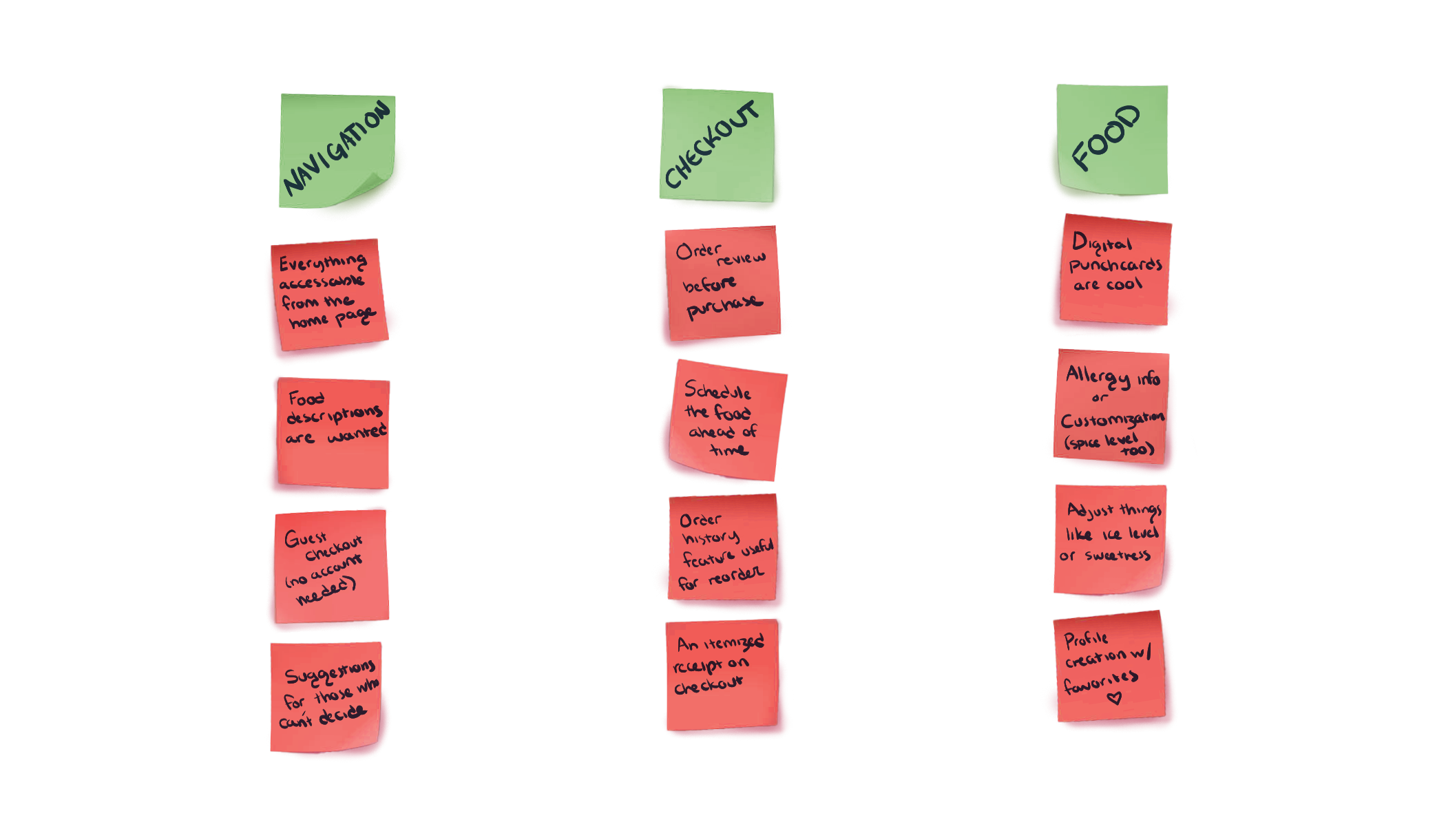
The research ended up bringing quite a bit of insight into how users feel about mobile food ordering apps. An affinity diagram was made to organize and sythesize the gathered data.
Meet the Users

Competitive Analysis
There are quite a few mobile food ordering apps out there, but very few center around Korean food. A handful of some larger companies were reviewed against the initial user research done, to see what was missing and what could be improved upon.
Some room for improvement or differences between competitors included confusing navigation or too many subcategories for food choices, the lack of information on the order confirmation screen, and none or limited customization of a food order.
Wireframes

Testing the Digital Prototype
After a low fidelity prototype was made, another set of volunteers were gathered to test the app in hopes of getting enough feedback to revise the current designs and make them as best as they could be.
The interviews and testing went well, and gave some suggestions on how to improve the design.
🟢 Menu positioning was confusing for some
🟢 A confirmation of action indication was needed as some users were confused as to whether their selections did anything
🟢 Some users wanted more written detail about the products they were browsing
Style Guide

High Fidelity Prototypes

Takeaways
As a Korean cuisine enthusiast, I enjoyed this project and found that I had a lot in common with the user base that I got to know through the user research conducted when it came to frustrations with ordering food online.
This was the first project that I made in Figma, and it was guided as part of the UX Design Certificate Program by Google. It was a really exciting way for me to dip my toes in a goal-oriented approach to UX Design, and I definitley learned quite a bit about how to incorporate user feedback into design through testing.
I’m currently searching for employment opportunities in UX Design and similar fields. I’d love to be a part of your team and bring my eye for color, shape, and design to your project.